EDDM Postcard Design Tips: Crafting Impactful Mail for Effective Marketing
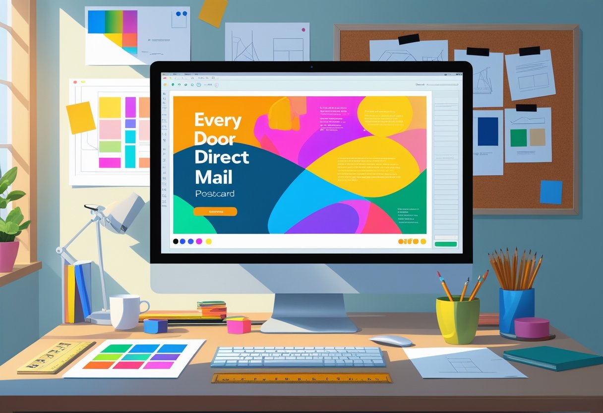
An effective EDDM postcard design comes down to five decisions: a headline of ten words or fewer, one clear offer, one call to action, a single strong image, and a USPS-legal flat size such as 6.25" x 9" or 6.25" x 11" printed on 14 pt or 16 pt cover stock. Mail Processing Associates (MPA) holds every EDDM card we print to those rules, because an EDDM postcard gets about a three-second look between the mailbox and the recycling bin and the layout has to read at arm's length. This guide walks through each of those decisions, plus the USPS size rules that determine what you can actually mail.
With Every Door Direct Mail (EDDM), USPS delivers your piece to every address on the carrier routes you choose, no mailing list required, with postage typically running $0.26 to $0.31 per piece. Because every household on the route receives the same card, the design carries the entire persuasion job; there is no personalization to lean on the way there is in list-based direct mail marketing.
Mail Processing Associates has printed and mailed EDDM campaigns from our Lakeland, Florida facility since 1989, and the advice below reflects what actually pulls response once a card is on press and in the mail stream.
Understanding EDDM Postcard Design Fundamentals
Three fundamentals decide whether an EDDM piece performs: the design elements on the card, the size you choose to mail, and the quality of the finished print. Get all three right before spending a dollar on postage.
Key Elements of Effective EDDM Postcards
Lead with a headline that names the offer or the outcome in ten words or fewer. Pair it with one image that shows the product, the result, or the neighborhood you serve; a single strong photo beats a collage every time.
Incorporate a call to action (CTA) that motivates the recipient to take the next step, whether it’s visiting your website or calling your business. Ensure readability by selecting bold fonts and maintaining a good contrast between text and background colors.
Also, include your business logo prominently. This builds brand recognition and trust. For best results, prioritize a clean layout with well-organized information to guide the reader effortlessly through the content.
Selecting the Right Size and Layout
Size is where EDDM differs most from ordinary postcards. USPS handles EDDM Retail pieces as flats, and a flat must be taller than 6.125 inches or longer than 11.5 inches; a standard 4" x 6" or 5.5" x 8.5" postcard does not qualify. The two most common choices are 6.25" x 9" (the standard) and 6.25" x 11" (the jumbo), and 8.5" x 11" qualifies as well since its 8.5-inch height clears the threshold. Keep the piece rectangular and under the 12" x 15" flat maximum.
Consider a landscape orientation if your design involves large visuals, while a portrait layout may work better for storytelling messages. Whichever you choose, ensure it aligns with your branding and effectively delivers the intended message.
Arrange elements in a way that keeps the reader's eye moving naturally from the headline to the CTA. Proper margins and spacing will prevent the design from feeling cluttered, ensuring every detail plays a role in communicating your offer.
Choosing High-Quality Postcard Printing
Print quality is visible at a glance. Run EDDM pieces on 14 pt or 16 pt cover stock; lighter sheets feel like flyers and pick up creases in mail trays. Build your file at 300 DPI with 0.125" of bleed on all four sides so color runs cleanly to the trimmed edge.
Our team at Mail Processing Associates preflights every EDDM file before it prints, checking bleed, resolution, and trim so soft images and clipped edges get caught before postage is spent.
Finish matters too. Gloss makes photography pop, while matte reads cleaner for text-heavy cards and is easier to write on. Pick based on what dominates your design.
▶ Get EDDM pricing for your area - Learn more about our eddm mailing services
Creative Visual Strategies for Postcard Design
Color, imagery, and hierarchy decide whether a card gets read or flipped past. Use each one deliberately.
Using Vibrant Colors and Contrast
Vibrant colors can evoke emotions and attract attention. Consider employing color psychology; for instance, red can stimulate excitement, while blue promotes trust.
Using contrasting colors will enhance readability. Pair light text on dark backgrounds or vice versa to draw attention to your message.
Make sure your color palette aligns with your branding. A consistent visual identity reinforces your brand and improves recognition. Experiment with bold, complementary colors to create a striking impact while ensuring harmony within your design.
Incorporating High-Quality Images and Imagery
Images play a vital role in postcard design. High-quality photos grab attention and convey professionalism. Ensure your images are sharp, relevant, and support your message.
Opt for imagery that resonates with your target demographic. This may include lifestyle shots or product images. Engaging visuals can evoke specific feelings or inspire action.
Collaborate with a professional photographer if necessary or use stock images that reflect your brand accurately. The right imagery not only enhances visual appeal but also strengthens your message effectively.
Optimizing Visual Hierarchy and Alignment
Visual hierarchy organizes information so that viewers can easily navigate your design. Emphasize the most important elements using size, color, or placement to guide the reader's eye.
Use headings, subheadings, and bullet points to create a clear path for your audience. This technique improves readability and ensures essential information is highlighted.
Alignment is crucial in postcard layouts. Proper alignment creates a clean, structured look. It helps convey professionalism and improves the overall visual appeal. Pay attention to balance and spacing between elements to create a cohesive design.
Test these choices at actual size: print a proof, set it six feet away, and check what still reads. That is roughly the distance at which a postcard gets judged on its way from the mailbox to the kitchen counter.
Crafting Compelling Messaging for Engagement
The copy does as much work as the design. Headline, message, and offer each have one job to do.
Writing a Bold Headline with Urgency
A bold headline serves as the first impression. It should grab attention instantly and communicate urgency. Use action words that convey a sense of immediacy, such as "Act Now" or "Limited-Time Offer."
Incorporate specific details like deadlines or discount percentages to enhance this urgency. For example, "Save 20% on Your First Purchase - Today Only!"
Ensure that your headline stands out by using larger fonts or contrasting colors. This makes it easy to read and encourages recipients to take a closer look.
Developing a Clear Message and CTA
Your message should be concise and to the point, focusing on the value you offer. Use simple language to explain what you provide and why it matters to the reader.
Integrate a strong call-to-action (CTA) that prompts immediate action. Phrases like "Visit Our Website" or "Call Today for a Free Consultation" are effective.
Position the CTA prominently, ideally near the headline or at the end of your message, making it clear what step the reader should take next.
Effective Use of Coupons and Special Offers
Incorporating coupons or special offers can significantly enhance engagement. Clearly display any available discounts or deals, ensuring the offer is compelling.
For example, a coupon for "Buy One, Get One Free" or a percentage off can be effective incentives.
Make sure to include terms and conditions, such as expiration dates, to create a sense of urgency. By framing these offers as exclusive, you encourage customers to act quickly.
Whatever the offer, keep it singular. Cards that stack a discount, an event, and a service menu split the reader's attention and depress response on all three.
🔍 Free Tool - Check your print file for free - DPI, bleed, CMYK, fonts
Maximizing Response with Tactical Design Tips
Three tactical elements consistently lift response: a scannable QR code, a visible logo, and contact information the reader never has to hunt for.
Incorporating QR Codes for Enhanced Engagement
Using QR codes in your postcard design can dramatically increase engagement. When readers see a QR code, they know they can scan it for immediate access to digital content. This could be a special offer, additional products, or an invitation to your website.
To optimize effectiveness, place the QR code in a prominent location. Ensure it’s large enough to scan easily and contrastive with the background. You might include a brief call to action, like "Scan for a special discount!" This simple addition can turn physical interest into digital interaction.
Integrating Your Logo and Brand Identity
Your logo is a crucial part of your brand identity. It creates recognition and trust with your audience. Make sure that your logo is prominently displayed on your postcard. This reinforces brand familiarity each time potential customers view your EDDM materials.
Keep in mind that consistent branding is vital. Use colors and fonts that reflect your brand's overall look. A unified color scheme across your marketing materials conveys professionalism and reliability, making your postcards more memorable.
Highlighting Phone Number and Contact Information
Clearly displaying your phone number and other contact information is critical. This allows potential clients to reach you easily, reducing barriers for responses.
Position your contact details in an easily visible spot, perhaps at the bottom or the top of the postcard. Use a legible font and consider bolding the phone number for emphasis. Including multiple contact methods, such as email or social media, can also enhance accessibility.
None of these three elements costs anything meaningful to add, and together they remove the most common reasons a ready-to-respond reader gives up.
Final Touches and EDDM Postcard Optimization
Three final checks before the file goes to press: white space, typography, and a plan for measuring what the campaign returns.
Leveraging White Space for Readability
White space, or negative space, is crucial in direct mail design. It helps guide the reader's eye and ensures important information stands out.
- Prioritize Key Information: Place significant details like your call to action (CTA) and offer in areas with ample white space.
- Avoid Clutter: Too much information can overwhelm the reader. Balance text with empty space to maintain focus.
- Enhance Aesthetics: A clean design looks professional and invites engagement.
Incorporating white space makes your postcard more inviting, encouraging recipients to absorb your message. Thoughtful placement can lead to better response rates.
Ensuring Readable Typography
Effective typography significantly influences how your message is perceived. Choose fonts that are easy to read and align with your brand identity.
- Select the Right Font: Use sans-serif fonts for clarity and readability. Avoid decorative fonts that may distract from your message.
- Consider Size and Hierarchy: Ensure headlines are larger than body text. A font size of at least 12-14 points for body text is recommended.
- Contrast for Visibility: Use high-contrast colors between text and background. This ensures that your copy stands out and is easily digestible.
These typography principles enhance communication in your EDDM marketing. Make sure your audience can quickly grasp the key points of your postcard.
Reviewing Your Marketing Campaign
Regularly reviewing your marketing campaign is essential for optimizing your EDDM efforts. Analyzing performance helps adjust strategies for better results.
- Track Metrics: Monitor key performance indicators such as response rates and ROI. Use this data to refine your targeting.
- A/B Testing: Test different designs, messages, or offers to see what resonates best with your target area.
- Feedback Loop: Gather recipient feedback. Use this valuable insight to improve future campaigns.
EDDM makes testing cheap because you target one carrier route at a time: run two designs on two comparable routes, compare response, and roll the winner out to the rest of the area.
Frequently Asked Questions
Common questions about EDDM postcard design, answered.
What are the essential guidelines to follow when designing an EDDM postcard?
Start with a clear objective for your postcard. Define your target audience and craft your message accordingly. Use high-quality images and ensure that your contact information is prominently displayed.
Incorporate a strong call to action. This guides recipients on the next steps, whether visiting a website or calling a number. Keep text concise and legible, utilizing appropriate font sizes.
How can one utilize design elements to create an effective direct mail postcard?
Visual elements should align with your brand identity. Use colors and fonts consistently to reinforce recognition. Balance text and imagery to maintain engagement without overwhelming the reader.
Incorporate white space effectively. This helps to draw attention to important information and prevents clutter. Images should be relevant and high-quality to create a professional appearance.
What are the best practices for incorporating branding into EDDM postcard designs?
Your logo should be prominently featured. It serves as a visual anchor for your brand. Make sure it’s clear and of high resolution.
Use brand colors throughout the design. This creates a cohesive look that reinforces your identity. Include your website and social media handles if applicable, encouraging further interaction.
What steps should be taken to ensure a postcard design is effective for EDDM campaigns?
Before finalizing your design, test it with a focus group. Gather feedback regarding clarity and appeal. Make adjustments based on insights to better resonate with your audience.
Ensure compliance with USPS regulations. Follow size and layout guidelines to avoid delivery issues. Prepare your mailing list carefully to reach the intended recipients. A free EDDM postcard template (6.25x9) with the size, bleed, and mailing panel preset takes the guesswork out.
What are common design mistakes to avoid in EDDM postcard creation?
Avoid cluttering the postcard with too much information. Stick to key messages to maintain focus. Small fonts can deter readers; opt for legible sizes.
Inconsistent branding can confuse recipients. Ensure that all elements reflect your business identity. Additionally, avoid using images that are low quality or irrelevant.
How can visual hierarchy be implemented to improve the impact of an EDDM postcard?
Establish a focal point by using bold headlines. This draws attention quickly. Position important information, like your call to action, in prominent areas.
Utilize size and color contrast to guide the reader's eye. Larger elements can signify importance, while color can highlight key points. This method effectively improves overall engagement with your postcard design.
"The marketing-mail margin most teams leave on the table is presort discipline. The difference between a 5-Digit automation-rate piece and a Mixed-tier piece is about 7 cents each. On a 25,000-piece drop that's real money, and nine times out of ten the list could have presorted cleaner."
Cat Boye, Head of Commercial Operations, Mail Processing Associates
Official reference: USPS Every Door Direct Mail (usps.com).